BUNDLU - YOUR AIDE-DE-CAMP
Drag & drop files
Document bundling platform that saves you time and hassle when creating document bundles for courts and other authorities. Easiest to use, fastest to produce. Guaranteed.
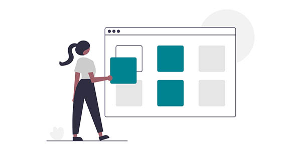
Simple & easy to use
Bundlu™ is your replacement of that internee who left you for giving him boring and labour intensive jobs. Creating court bundles no longer is a job that you would hate doing. With simple drag, drop & create features, your document bundle is ready in minutes for printing or accessing online anywhere.
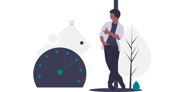
Fastest bundle creation tool online
Bundlu™ is a robot packed with artificial intelligence, power and passion. It executes your instructions ensuring that your court document bundles are accurate, navigable and presentable. Version tracking, easy restoration, sharing and archiving are some of the built-in feature.
Fastest bundle creation tool online
Gone are the days when you had to spend hours creating court document bundles. With our SaaS document bundling platform, you can create document bundles with correct sections and pagination on the fly. This no longer is a laborious task. You might start loving your job again.
It has commercial benefits to it too. The software not only pays for itself but earns for you in the sense that the time you used to spend on creating bundles manually can now be invested in your core job that earns you money.
Our court bundling software can be used as part of the case management system or as a standalone subscription. All you need is an Internet connection and a computer/tablet.
FREE SIGN UP

Who is Bundlu For?
Local Government, City & County Council Offices, Courts, Law Firms, Attorneys, Corporate Legal Departments, Litigators, Debt collectors and the private sector.
Bundlu offers cost savings, enhances efficiency, reduces risks and promotes professionalism. There is no software to install, no expensive maintenance contracts to maintain and no security risks. Bundlu runs as a SaaS and upgrades / updates are immediately available.
FREE SIGN UPBUNDLU BENEFITS

Paperless Environment
Reduce your stationery expense. With electronic bundling system, you do not need as much paper as your would otherwise.

Printing Shredding?
No need to print large amount of papers and then pay for secure shredding. Bundlu documents are electronically available.

Save Time, Save Money
Preparing court bundles manually is a time consuming job, thus cost money. With Bundlu you can save loads and stay ahead.

Instant Deployment
Bundlu is delivered in the cloud on a Software As A Service (SaaS) basis. You could be up and running in minutes with no capital cost to you.

Security
With reduced exposure of paper based court bundle versions, you automatically reduce the risk of data loss.

Availability
Bundlu integrates with most popular cloud storage providers, including Microsoft OneDrive and GoogleDrive, or your own local storage.